Bob Ross was a painter who is best known for his television show “The Joy of Paining”, which was shown on public broadcast stations across the United States. Bob Ross died at the age of 52 in New Smyrna Beach, Florida from lymphoma.


Two Japanese Wrestlers by a sink, was done on oil on canvas, by Lucian Freud from 1983-87. At first I didn’t really understand the name until I looked more closely to the top left and you can see two legs and a torso. I like that he really showed what a studio sink looks like. And also when I looked this painting there was a lot of different interpretations from him being the great grandson to Sigmund Freud to him showing his independence from Sigmund.

 Metamorphosis of Narcissus (1937) is an oil-on-canvas painting. This painting is from Dalí's Paranoiac-critical period. According to Greek mythology, Narcissus fell in love with his own reflection in a pool. Unable to embrace the watery image, he pined away, and the gods immortalized him as a flower. Dali completed this painting in 1937 on his long awaited return to Paris after having had great success in the US.
 The painting shows Narcissus sitting in a pool, gazing down. Not far away there is a decaying stone figure which corresponds closely to him but is perceived quite differently; as a hand holding up a bulb or egg from which a Narcissus is growing. The egg has been used as a symbol for sexuality in other paintings by Dali. In the background, a group of naked figures can be seen, while a third Narcissus like figure appears on the horizon.

 The painting above is "I, Women" by De Kooning. The medium used for the painting is oil on canvas. It was painted in 1952. I personally do not like this painting at all. The color scheme is somewhat intriguing. However the women in the picture appears to me as a monster rather then a women. The only reason you can tell it is in fact a women is by the prominent breasts shown in the picture. I do not find this picture pleasing to look at and is by far one of the least flattering pictures i have seen all year.

 Shining Black was made by Sam Francis in 1958 and is oil on canvas. Sam Francis adopted Jackson Pollock's technique of pouring liquid paint onto a canvas which is clearly seen in this painting. He made kidney shapes in the painting which added a different style then what Pollock's paintings were made up of. I think this painting is very interesting and the use of color is very appealing. Since he used such bright oranges, purples, blues, yellows and greens the black in the paining really stands out.
 "Room in Brooklyn" was painted by Edward Hopper in 1932 on oil on canvas. The painting hangs in the Museum of Fine Arts in Boston. I chose this painting because I really enjoy Edward Hooper's paintings. I think the composition of his work is very intriguing. I like how a lot of his paintings make the viewer feel as if they are peering in on a scene on normal American life. I like how he painted images from a side view and includes people with their backs to the viewer. I think this type of composition makes the viewer feel as if the scene is actually occurring in front of them.
 This painting titled "Red, Orange, Tan, Purple" was created by Abstract Expressionist Mark Rothko. The oil on canvas painting was completed in 1949. I have mixed feelings towards the concept of color field painting. I do not like the fact that its very plain. However, the aspect I do like is the different combinations of color that is used throughout the piece. The colors in this piece really attracted me towards it; I love the color combination of pink and yellow.
 The Red Model is an oil on canvas painting created in 1935 by Rene Magritte. Magritte made masterful fantasies of everyday objects such as an old pair of shoes. He made more paintings of this subject but this was one of his earliest of shoes turning into feet.Magritte demonstrates how easily the viewer confuses the image, as a depiction, with the reality it both describes and obscures. His works are like a link between what is and what we see. Magritte expresses scepticism, doubt, and not always mild irony about the conditions of the mind. The reason i chose this painting was because i think the idea is very clever. although it at first confuses the viewer, it also gets them to really think about what the painting is trying to do. it gets the viewer to look closer and understand his irony.
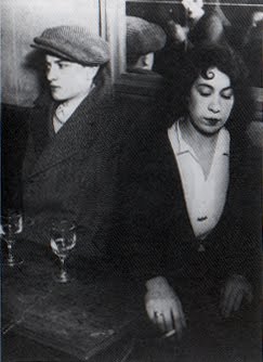
Gyula Halasz also referred to himself as Brassai, after his native city, Brasso arrived in Paris in 1924. He lost his heart to the city with its streets, squares, backs ally’s, bars, and cafes. Once he was introduced to the small camera be turned nocturnal and began spending the hours from dusk to dawn in pursuit of the “ decisive moment”, when gesture, expression, time, and place allowed character to be revealed at its most naked. I really enjoy his picture Dance Hall. 1932. Gelatin silver print. It really showed cosmopolitan Paris, which was exactly the look that Brassai was after.
 Cinemascope was created by Mimmo Rotella in 1962 using torn posters on canvas. The artist took wall posters, mostly those that were pasted one over the other, by vandals as well as by weather, until the work pealed and shredded therefore different parts and bits of all the layers from each poster showed through. To finish the piece of work, the artist had to mount the piece on a canvas, but also distressed the sheets so that they finally produced ab Abstract Expressionist painting. Rotella mostly used movie promos, soap opera ads, and political statements.


 Bellatrix by Morris Louis was made in 1961. it is an acrylic on canvas, 7' 1 3/4 x 5'10 and is located New York. it shows transparent overlays og color give way to open p and clearly tell the difference between the ribbons of different hues and shape. defining edges resulted from the natural process of drying rather than from any inflection of the hand. the painter Louis helped release new energy to younger artists. he died in 1962


 The painting "Nighthawks" by Edward Hopper is considered to be one of his most famous paintings. It was painted in 1942. This painting depicts a couple and a man sitting at a bar with a lone bar attendant late at night. This painting does an excellent job of portraying loneliness and solitude. It is apparent that the bar is located in a city because of all of the buildings in the background, and yet no one is on the streets. I researched this painting and discovered that it was inspired by the attack on Pearl Harbor in 1941. Supposedly, Hopper meant to convey the gloominess that spread across the country following the attack.
 This is a screen print that Andy Warhol created in 1987. It was based on two NASA photographs that were taken by Neil Armstrong of Edwin Aldrin, Jr. walking on the moon for the first time in 1969. I really like this screen print because I like the story behind the photos that were used for it. Also I like the colors that were used, I think that are very compatible with each other. I really like pop art and wanted to see what other kinds Warhol had done since I always learned about the famous Marilyn Monroe ones and the Mickey Mouse ones.
 This photo series is of Edie Sedwick, a muse of Andy Warhol. She was a socialite who inspired Andy. He used her as a model for photos and short films. She quickly became an 'it' girl, ' known for her door knocker earrings and fashion statements. I love this photo-booth like picture. Its so cute and fun, it reminds me of pictures I take with my friends.

Andy Warhol (1981)
Pop Art was an early form of Post Modernism. It was developed in the 1960's and depicts scenes and objects from everyday life such as art, illustrations, films, and comic strips. It even explores the cult of celebrities which includes fictional characters such as Mickey Mouse, the icon of youth and Disney. His other works of the time such as Campbell’s Soup Cans and Marilyn Monroe in fact mean little to me personally, but they nonetheless represent popular themes of that particular decade. Mickey Mouse however has surpassed the twentieth century and continues to symbolize childhood and innocence. Hence, this artwork has made me realize and appreciate the meaning of pop art, which is its representation of the current popular, cultural phenomenon.

Reflection was a self portrait done by Lucian Freud in oil paint. He was around the age of 63 when he did this painting. Prior to this, I’ve never heard of Lucian Freud or seen any of his work. I really love the way he paints and love his brush work. Particularly in this painting, he applied the paint so thickly that it left bumps and a sort of roughness to the painting. Freud was known to harshly replicate the human body, a lot of his subjects show this. He wasn’t concerned with making the body look beautiful. He intended to portray the body how it looks, even with all its imperfections.

Jimmy Best was done by Jean Michel Basquiat in 1981. The medium used was spray paint and oil paintstick on metal panel. When I first saw this piece I didn’t really understand it. I had trouble making sense of what Basquiat was trying to say. After discussing this work in painting class last semester, It’s kind of stuck with me. I actually think his words are extremely powerful. Some say Basquiat was trying to convey that our past experiences effect our future. That our “childhood files” can essentially sucker punch us and keep us on our back while instilling us with fear of getting up and getting knocked down again.