
African Mask, unknown artist.
I picked an African Mask because i like the colors that was used on the mask. I like how you can tell there is a face and a mouth. It's more of a girlie mask


Raoul Hasumann (1919)
Raoul Hausmann was a leader of the German Dada movement in which art became a reflection of the shattered explosions from WWI. From their perspective, the fragmentation of art was a measure of the fragmentation of life, which was grotesquely manifested by the war. Hence this work by Hausmann was constructed from a hairdresser's wig-making dummy with various measuring devices attached to it—including a ruler, pocket watch mechanism, typewriter, camera segments, and a crocodile wallet. Hausmann was inspired by his belief that the average German "has no more capabilities than those which chance has glued on the outside of his skull; his brain remains empty.” A critique in contrast said that “this is a head whose ‘thoughts’ are materially determined by objects literally fixed to it.” Personally I also feel that this represents our thoughts but projected into reality. Therefore it is a conceptual assemblage that is both laughable and political.


.jpg)

 This painting was made by Mark Chagall in 1911 and is oil on canvas. A lot of Chagall's work presents dreamlike imagery and this painting shows just that. In this painting there are images that are some what like a dream process of a cow which is placed on the left side of the painting. I think this painting is very interesting and cool to look at. There are so many images placed in it that a viewer is almost never bored looking for something new in the painting. The use of color also makes the painting very interesting. All the colors used are bright and fun to look at in the images they are used for.
 "Woman in a Purple Coat" is an oil on canvas painting done in 1937 by Henri Matisse. The woman in the picture is supposed to be Matisse's assistant and companion Lydia Delectorskaya. this painting is an example of his mature decorative style. Lydia is shown in an exotic Moroccan costume, surrounded by a complex of abstract design and exotic color. This is an example of one of the final groups of oil paintings in Matisse's career, in 1950 he stopped painting oil paintings in favor of creating paper cutouts. the reason i chose this painting is because it is one of Matisse's last paintings and although his arthritis was taking a toll on him, his talent still remains. i love the colors in this painting and especially how the purple coat stands out from the rest of the painting.

"The Snail" is a cutout picture done by Henri Matisse in 1952. it is pigmented with gouache on paper, and cut and pasted on to a base layer of white paper. it is found in the Tate Gallery in London. it consists of a number of colored shapes, arranged in a spiral pattern. From the early to mid-1940s Matisse was in increasingly poor health, and was suffering from arthritis. Eventually by 1950 he stopped painting in favor of his paper cutouts. "The Snail", is a major example of Matisse's final body of works known as the cutouts. the reason i chose this picture is because at first when i looked at the picture i didnt understand why it was considered famous, but when i read that it was part of the cutout collections from matisse i understood why he made that type of art.
 I think this piece is awesome! How many times in your life do you get to see a 45' clothespin! I mean, its amazing. It stands in the Center Square of Philadelphia. It was create by Claes Oldenburg in 1976. I have been to Philly quite a few times in my life but have somehow missed a 45' clothespin when I am there. It is made of steel with a steel base and it just a true fascination for the eye. This is the kind of stuff you can't make up. If you do not believe this, something that must have taken hours to recreate is not art, then you don't know true art.
 This is a work of art by Marcel Duchamp created in 1919. This is a type of art work that Duchamp called readymades. Readymades were taking objects that are not considered art and transforming them to what he thought was art. This is a cheap postcard of the Mona Lisa in which he added a mustache and titled it "L.H.O.O.Q" which if said fast in French sounds like the sentence "Elle a chaud au cul" which translates to "She has a hot ass". When we learned about this in class on Monday I thought that this was funny and wanted to see what it looked like myself. Obviously people of Duchamp's time did not find it funny and thought that it was an attack on a famous artwork. Duchamp however, felt that readymades were not making fun of art but were forcing people to look at art from a different perspective.
 This painting is called "The Bathroom" and it is by Pierre Bonnard. Its a oil on canvas and the size is 47 5/8 by 46 1/2. The painting is of Bonnard's bathroom at his home and the woman is his wife Marthe with their dog. The interesting thing is that Bonnard's wife appears in many of his paintings but her face is never visible. I think that is interesting that he paints his wife but the audience never sees her face. When he painted this he didn't have a sketch he did it by free hand and by memory. I like this painting a lot. I like the colors that he used and I like that he used his own family and bathroom in the painting. The painting is relateable to people who are looking at it. I also like how he did this by meomory and just a few small sketches as aides. Overall I really like the painting.
  The painting "Wedding" is by Marc Chagall. It was painted in 1918. It is said that Chagall had difficulty persuading his future wife's parents that he would be an acceptable husband for the daughter. His in-laws were afraid that a painter would be unable to support their daughter, but Chagall was confident that he would be able to. I like this painting because it is very light-hearted and romantic. I think the fact that they entire painting is black and white with the exception of the red cupid, helps to convey the concept of love. I also like how in the background there is a musician in the tree, serenading the happy couple on their wedding day.


In Frida Kahlo’s oil painting entitled The Two Fridas created in 1939 Kahlo is portrayed being split in two placed in front of a cloudy and stormy setting. When this painting was created in 1939, Frida and Diego had just made their divorce final. The Frida on the left, in the white European dress, is clearly heart broken at the thought of their marriage having ended. The clamp symbolizing her cutting off her connection to him. The Frida on the right, dressed in traditional Mexican clothes is holding Diego, possibly intending to represent when they still loved each other. I like this painting because of the meaning behind it. The painting tells it's own story and shows two sides of who Frida was.


Frida Kahlo (1949), oil on masonite
Diego and I is an undeniable representation of Frida Kahlo’s complicated relationship with Diego Rivera. Although Diego had been expectedly promiscuous in the past, an affair with her sister, Cristina, was too much for Frida to bear. Based on this painting, it seems as if Diego had some sort of power over her (as showed by the third eye). Furthermore, Frida’s hair is wrapped around her neck suggesting that he is restraining or suppressing her. Even the red and scarlet colors convey the passion and pain that the couple shared. It is very unfortunate that she loved him unconditionally yet he remained unfaithful to her—even though loyalty was the only thing she desired.
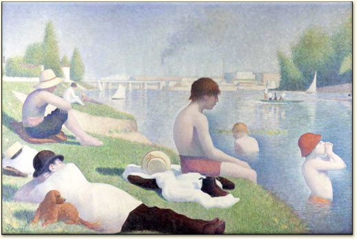 Bathers by Seurat is an oil on canvas. the painting is in London. this painting was made in the movement of pointilism. I like the colors and the reflection inside the water. i like that Seurat put people on the grass and in the water. it looks like a nice hot summer day. i can not wait until summer because of this picture. thats why i chose to write about

 Street in Dresden: Ernst Ludwig Kirchner oil on canvas
 The picture above is called Number 1 by Jackson Pollock. It was painted in 1950 using the medium enamel and aluminum paint on canvas. I personally do not understand this painting at all. The many random directions of colors are intriguing but I do not understand how he gained such fame from these paintings. They supposedly tell a story however I do not see it. I feel it would be fun to create one of these but I don't see how much talent is involved. It appears the paint is just randomly splattered about with little thought. Although this is probably not true it is how I feel when I view his artwork.
 This oil on canvas painting titled "Sunflowers" was created by Post-Impressionist, Vincent VanGogh . It was created in Arles in January 1889. I liked this painting because sunflowers are one of my favorite flowers. I also liked how the flowers stand out even though VanGogh used the around the same color throughout the whole painting. The dying flowers as well as the bright, open flowers gives the painting as sense of time because all flowers in a bouquet aren't all open or all dead at the same time.
 I took this picture when I studied abroad in Barcelona, Spain when I lived near a park that had this Joan Miró sculpture/mosaic. For months I thought it was just a random, cool sculpture that I saw from the street until one day I took a walk through the park and realized that it was a Miró piece. In Catalan, "Dona i Ocell" translates to Woman and Bird. This is not part of the modern art era but I thought that it was cool that a random piece of art in a little park was actually something significant.


Georgia O’Keeffe’s oil on canvas painting called Blue Morning Glories was done in 1935. O’Keeffe was a groundbreaking modernist painter who digressed from realism to express her own visionary style. She was raised in rural Wisconsin, which gave her a love of nature. She is best known for flower paintings, which made up a significant percentage of her work. She painted enormous close-ups of flowers and she highlighted their importance in a manner that attracted attention. I find this painting quite pretty and enjoy the use of shading.
 The painting "Girl Before A Mirror" by Pablo Picasso was painted in 1932 on oil on canvas. This painting is a true example of the Cubism that Picasso became famous for. The subject of the painting is said to be Marie-Therese Walter, who was a love interest for Picasso. The painter was preoccupied with confronted opposites and rich colors. I like how the woman's reflection is painted in darker shades of color. This may imply that the woman has a more sinister image of herself. It is also interesting how the woman's arm is outstretched and holding on to the side of the mirror, as if she could in some way hold onto herself.

 Blue Horses was made by Franz Marc in 1911 and is oil on canvas. It is one of Franz Marc's typical paintings showing animal existence in nature. The use of color and shape in this painting makes it extremely beautiful and interesting. The colors used for the horses are not typical yet it works for the painting. I think this paining shows the beauty of these animals, from their body shape to their movements they may be making. I enjoy many of Franz Marc's paintings but this one is especially appealing to me.


 Explosion, by Salvador Dali was done on "ink on paper" in 1954. Soft Watch at the Moment of First Explosion, (also known as The Melting Watch, Clock Explosion, or simply Explosion) is an example of this surrealist movement. Dali used the presence of a dreamlike quality and ghostly appearance to accentuate the mysterious and unexplainable in his painting. Dali assimilates shadowy outlines of objects and uses the dreamlike quality in the way the watch twists and its broken pieces unexplainably float above it. Also, the ghostly way the watch drapes over one edge of the box as if melting. The watch seems to be pulling apart and stretching. It may denote Dali’s belief that time passing brings eventual destruction.
 "Fighting Forms" is a painting by German expressionist Franz Marc. Along with Kandinsky, March founded the Blue Rider movement. This painting was created in 1914 and depicts a swirl of red that seems to be fighting with a swirl of black. I really enjoy this painting because I feel as if there is two contrasting images fighting against each other for their survival. Marc typically paints pictures of animals, specifically horses. I believe, that even though you can not tell what shape these swirling objects are, that they are indeed horses. This painting is an example of non-objective abstraction, which is what Kandinsky and he were famous for. March was noted for saying, “Objects speak: objects possess will and form, why should we wish to interrupt them! We have nothing sensible to say to them. Haven’t we learned in the last thousand years that the more we confront objects with the reflection of their appearance, the more silent they become?” I believe this quote sums of this painting in the sense that, yes there is two objects fighting in the painting. It is obvious that there are, however what they are is not obvious, and if you bring their true identity to focus then the painting just wouldn't be as powerful as it is.
 Georges Braque's Nude woman with a basket of fruit is a 5'3 x 2'5 oil on canvas. The art work portrays a woman half nude sitting while holdiong a basket of fruit. What seems to be odd about this painting is the shape of the woman's body. Her face looks pretty refined with long hair like most women would, but her upper body looks very muscular and manly. She seems to have a woman's chest but her core is tight and packed with abdominal muscles. The artist uses very dark and dull colors like brown, black and dark blue. The artist may not have wanted to focus on usual appearances but wanted to based his paintings on a certain mood.
 The Statue of David is a renaissance sculpture done by Michelangelo between 1501 and 1504. Its a 17 foot standing statue of a man nude. The statue represents the Biblical hero David, a favored subject in the art of Florence.Originally commissioned as one of a series of statues of prophets to be positioned along the roofline of the east end of Florence Cathedral, the statue was instead placed in a public square, outside the Palazzo della Signoria, the seat of civic government in Florence, where it was unveiled on september 8th 1504. the statue was eventually moved to the Accedemia Gallery in Florence in 1873 and the original one outside was replaced by a replica. the reason i chose this statue was because i have a miniature statue of this in my house and its a prized possession in my family. I also am going to study italian art in florence in may and would love to see the original statue of David.

Winslow Homer’s painting Northeaster is an oil on canvas done in 1895. It’s absolutely beautiful and it caught by eye because of the earthquake and tsunami that just hit Japan recently. The colors or the waves and sky are very dark making it look like it is a bad storm. Winslow Homer is known for his sloshing dark sea- scenes. He was well liked during his lifetime but critics were taken a-back by the harsh images and lifestyles he depicted.
 This picture by Emil Nolde was created in Seebull, Germany. This artist worked on contrasts of colors that showed some emotional problems. To me this picture showed some type of pain because the sky is orange and purple and it just showed alot of emotion when i first looked at it. i like this picture because of the colors and the depressed mood it puts me in when i try to figure out whats going on in the pic

Franz Marc (1913), oil on canvas
Inspired by the Impressionists, particularly Vincent Van Gogh, Francis Marc began his intensive study of animals in their natural setting. Among the Independent German Expressionist, his works in particular were characterized by bright primary colors, bold simplicity, and a profound sense of emotion. In The Fate of the Animals, he even displays a style that markedly resembles cubism. This has been known to be an apocalyptic image, showing the destruction of the natural world due to industrialization. It was painted on the eve of World War I, inspired by tensions of the prewar period. Marc even noted “it is like a premonition of this war, horrible and gripping.” Sadly, WWI would be the very instrument of his end when a shell splinter struck him in the head, killing him instantly.
