 "Room in Brooklyn" was painted by Edward Hopper in 1932 on oil on canvas. The painting hangs in the Museum of Fine Arts in Boston. I chose this painting because I really enjoy Edward Hooper's paintings. I think the composition of his work is very intriguing. I like how a lot of his paintings make the viewer feel as if they are peering in on a scene on normal American life. I like how he painted images from a side view and includes people with their backs to the viewer. I think this type of composition makes the viewer feel as if the scene is actually occurring in front of them.
Saturday, April 30, 2011
Room In Brooklyn
"Room in Brooklyn" was painted by Edward Hopper in 1932 on oil on canvas. The painting hangs in the Museum of Fine Arts in Boston. I chose this painting because I really enjoy Edward Hooper's paintings. I think the composition of his work is very intriguing. I like how a lot of his paintings make the viewer feel as if they are peering in on a scene on normal American life. I like how he painted images from a side view and includes people with their backs to the viewer. I think this type of composition makes the viewer feel as if the scene is actually occurring in front of them.
Thursday, April 28, 2011
Color Field Painting
 This painting titled "Red, Orange, Tan, Purple" was created by Abstract Expressionist Mark Rothko. The oil on canvas painting was completed in 1949. I have mixed feelings towards the concept of color field painting. I do not like the fact that its very plain. However, the aspect I do like is the different combinations of color that is used throughout the piece. The colors in this piece really attracted me towards it; I love the color combination of pink and yellow.
Wednesday, April 27, 2011
Mountain

Bob Ross is the artist of this painting and I really love this picture because its beautiful. The use of colors and the fact I am sweating right now, is really cooling me off. I feel like its a mix of summer because of the river and trees and then you see the white mountain and it feels like winter.
The Red Model
 The Red Model is an oil on canvas painting created in 1935 by Rene Magritte. Magritte made masterful fantasies of everyday objects such as an old pair of shoes. He made more paintings of this subject but this was one of his earliest of shoes turning into feet.Magritte demonstrates how easily the viewer confuses the image, as a depiction, with the reality it both describes and obscures. His works are like a link between what is and what we see. Magritte expresses scepticism, doubt, and not always mild irony about the conditions of the mind. The reason i chose this painting was because i think the idea is very clever. although it at first confuses the viewer, it also gets them to really think about what the painting is trying to do. it gets the viewer to look closer and understand his irony.
Dance Hall
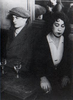
Gyula Halasz also referred to himself as Brassai, after his native city, Brasso arrived in Paris in 1924. He lost his heart to the city with its streets, squares, backs ally’s, bars, and cafes. Once he was introduced to the small camera be turned nocturnal and began spending the hours from dusk to dawn in pursuit of the “ decisive moment”, when gesture, expression, time, and place allowed character to be revealed at its most naked. I really enjoy his picture Dance Hall. 1932. Gelatin silver print. It really showed cosmopolitan Paris, which was exactly the look that Brassai was after.
Cinemascope
 Cinemascope was created by Mimmo Rotella in 1962 using torn posters on canvas. The artist took wall posters, mostly those that were pasted one over the other, by vandals as well as by weather, until the work pealed and shredded therefore different parts and bits of all the layers from each poster showed through. To finish the piece of work, the artist had to mount the piece on a canvas, but also distressed the sheets so that they finally produced ab Abstract Expressionist painting. Rotella mostly used movie promos, soap opera ads, and political statements.
Sun and Rocks

War is no Nice

This painting gave me a good laugh. This is by Martin Kippenberger and I just think its hilarious. It is called War is no Nice and I love the falic symbol they created the cannon into. It is a representation of the DaDaist movement and I think its amazing. The use of greens and pinks instead of a typical war color gives the image its edge and the way everything is thrown together is just so Dada. The Dadaist were against war and everything it stood for so they conformed to paint, sculpt, and write against it. I believe this painting is a true creation to the Dada movement. It is inspirational and hilarious.
The Oasis

This is another painting by surrealist Rene Magritte called "The Oasis" done between 1925-1927. I looked up the meanings to this painting and I dont really understand it. Reviews say that surrealists experience some sort of "Yggdrasil" and psychological experiences, and thats why he painted the 3 trees that represent Druid. He apparently saw God as being a woman in the Earth. This painting is unique, I just dont understand the meaning of it. I dont get why there are trees comming out of a table.
Tuesday, April 26, 2011
Bellatrix
 Bellatrix by Morris Louis was made in 1961. it is an acrylic on canvas, 7' 1 3/4 x 5'10 and is located New York. it shows transparent overlays og color give way to open p and clearly tell the difference between the ribbons of different hues and shape. defining edges resulted from the natural process of drying rather than from any inflection of the hand. the painter Louis helped release new energy to younger artists. he died in 1962
At the telephone- Alexander Rodchenko
At the telephone is a gelatin silver print by Alexander Rodchenko. The polymath Alexander Rodchenko (1891-1956) is a discipline of Tatlin ad Malevich, may be the most representative figure of those who began in the avant-garde movement in Russia and adapted to the demands of the Soviet Union. This black and white art work shows the portrait of a woman on the phone from a bird's view. The artist is also a master in photography , visual arts, typography, film and stage design.

Mother and Child, San Franscio

This painting is called Mother and Child and it is by Dorothea Lange. I was curious to see what other work was done by Dorothea Lange and when I searched her name on the MOMA website this is what came up. It was done in 1952 and it's medium was geltain silver print. This picture is classified under photography. I really like this picture because it is what I picture people looking like back in the day. I also like how the woman and child are not posing and it seems like someone took it while they were walking by. The black and white portrait makes the painting so much better. I don't think the picture would have the same meaning or feeling if it was done in color.
Battle of Lights

"Battle of Lights, Coney Island" was painted by Joseph Stella in 1913. The medium used was oil on canvas. It can currently be found the Yale University Art Gallery. It shows the park at Coney island which is located on a board walk with a ferris wheel in the center. It colorful nature is pleasing to the eye. The chaos seems to come together to form a carnival like theme similar to the one that can be seen a Coney Island. I personally have been to Coney Island and although it has changed over the years I like the depiction Stella has made.
Nighthawks
 The painting "Nighthawks" by Edward Hopper is considered to be one of his most famous paintings. It was painted in 1942. This painting depicts a couple and a man sitting at a bar with a lone bar attendant late at night. This painting does an excellent job of portraying loneliness and solitude. It is apparent that the bar is located in a city because of all of the buildings in the background, and yet no one is on the streets. I researched this painting and discovered that it was inspired by the attack on Pearl Harbor in 1941. Supposedly, Hopper meant to convey the gloominess that spread across the country following the attack.


Monday, April 25, 2011
Moonwalk, 1987
 This is a screen print that Andy Warhol created in 1987. It was based on two NASA photographs that were taken by Neil Armstrong of Edwin Aldrin, Jr. walking on the moon for the first time in 1969. I really like this screen print because I like the story behind the photos that were used for it. Also I like the colors that were used, I think that are very compatible with each other. I really like pop art and wanted to see what other kinds Warhol had done since I always learned about the famous Marilyn Monroe ones and the Mickey Mouse ones.
 This photo series is of Edie Sedwick, a muse of Andy Warhol. She was a socialite who inspired Andy. He used her as a model for photos and short films. She quickly became an 'it' girl, ' known for her door knocker earrings and fashion statements. I love this photo-booth like picture. Its so cute and fun, it reminds me of pictures I take with my friends.
Mickey Mouse 2

Andy Warhol (1981)
Pop Art was an early form of Post Modernism. It was developed in the 1960's and depicts scenes and objects from everyday life such as art, illustrations, films, and comic strips. It even explores the cult of celebrities which includes fictional characters such as Mickey Mouse, the icon of youth and Disney. His other works of the time such as Campbell’s Soup Cans and Marilyn Monroe in fact mean little to me personally, but they nonetheless represent popular themes of that particular decade. Mickey Mouse however has surpassed the twentieth century and continues to symbolize childhood and innocence. Hence, this artwork has made me realize and appreciate the meaning of pop art, which is its representation of the current popular, cultural phenomenon.
Reflection

Reflection was a self portrait done by Lucian Freud in oil paint. He was around the age of 63 when he did this painting. Prior to this, I’ve never heard of Lucian Freud or seen any of his work. I really love the way he paints and love his brush work. Particularly in this painting, he applied the paint so thickly that it left bumps and a sort of roughness to the painting. Freud was known to harshly replicate the human body, a lot of his subjects show this. He wasn’t concerned with making the body look beautiful. He intended to portray the body how it looks, even with all its imperfections.
JIMMY BEST

Jimmy Best was done by Jean Michel Basquiat in 1981. The medium used was spray paint and oil paintstick on metal panel. When I first saw this piece I didn’t really understand it. I had trouble making sense of what Basquiat was trying to say. After discussing this work in painting class last semester, It’s kind of stuck with me. I actually think his words are extremely powerful. Some say Basquiat was trying to convey that our past experiences effect our future. That our “childhood files” can essentially sucker punch us and keep us on our back while instilling us with fear of getting up and getting knocked down again.
Study

The drawing titled "Study" was done in 2003 by Nick Mauss. It was done with oil, colored pencil, felt-tip pen, and ink on paper. I found this drawing on the MoMA website and it instantly caught my eye. I like the random use of color adds to this piece because it is mainly drawn in black. The nice, bright colors drew my attention while searching the MoMA website.
Sunday, April 24, 2011
Fallen Angel
 Fallen Angel is a painting by Jean Michel Basquiat created in 1981. I really like this painting because I think it depicts that sorrow and anger that a "fallen angel" would have gone through. Fallen angels according to religious views are those that are banished from Heaven. In a way, I believe that Basquiat was trying to convey that he was a fallen angel. This painting has so much emotion in it. I really enjoy Basquiats works because they are unlike anything I have ever seen before.
Wednesday, April 20, 2011
Joan Miró - Still Life with Old Shoe (1937)
 I found this painting on the MOMA site and thought it looked really cool like a photo negative or positive with weird colors added in and almost has like a strange hallucination aspect to it. There's random object in it which don't make sense but I like it. The story behind why Miró made this painting is also interesting...
"Miró left Barcelona for Paris sometime before October 28, 1936. With the civil war in Spain advancing without a foreseeable end, he decided to remain in the French capital; his wife and daughter joined him in December. They would not return to Spain for four years. On January 12, 1937, Miró announced his intent to do “something absolutely different,” to return to working from life. The result is the incandescent, hallucinatory painting Still Life with Old Shoe."
Le Gueridon (the round table) - Georges Braque 1929

Braque's 4'11 1/4" x 3' 8 3/4" oil on canvas is a the combination of objects usually found in the house as a still life. the compositon of these flat objects is rich in texture and somber tonalities. Somewhat abstract, the objects are still identifiable and make a beautiful composition in harmony once put together with enough measure, clarity and balance needed.
Galaxy

Jackson Pollock (1947), oil and aluminum paint on canvas
Galaxy is a work by Jackson Pollock that apparently inspired by the night sky. It marked an important transition in his career in which he tried to display mathematical principles in chaotic motion. In fact, while contemplating on the distant galaxies of outer space, Pollock began reconsidering his own concepts of artistic space. For instance, Galaxy exhibits wider distances between each item compared to many of his other works. The colors also display a more extraterrestrial color scheme, befitting the title and image.
The Pink Panther

The Pink Panther, done by Jeff Koons in 1988 with porcelain, 41 x 20 1/2 x 19". This was featured at the MoMa but is no longer feauted there after it was sold for $1,817,500. This statue features "sensual" topless women being caressed by the iconic pink panther. This is rather controversial because the pink panther is a beloved childhood carton. The combination of sex and desire with this cartoon character is what makes it so interesting. I don't really like it, it kind of weirds me out how this lady is being caressed by a pink tiger that appears in children shows. But the crafts man ship is very well done and detailed, I'm just not a fan of the actual sculpture.
Persimmon

Robert Rauschenberg oil and silkscreen on canvas painting Persimmon was done in 1964. As Rauschenbergs style evolved he utilized silkscreen imagery taken from photojournalism to transform the art experience. He was perhaps the first artist to test this. I really enjoy the colors he used together and the different images.
Pavement Picasso

Julian Beever. Julian is famous for his incredible 3D chalk art he draws in the streets. It is carefully drawn at incredible angles so that when the viewer stands in front of it, the art looks like it jumps off the street completely in 3D. His 3D chalk art is often drawn in long stretches of pavement. It is hard to make out what is is supposed to be from the back or the sides but from the front you can’t help but be awed by the artwork. I think his work is amazing and I love how he can make the art come to life, like this butterfly. Its insane how he can make a chalk picture appear 3D.
Tuesday, April 19, 2011
Synchromy in Orange
 The picture above is called 'Synchromy in Orange: To Form" by Morgan Russell. The medium used was oil on canvas. It was painted between 1913-1914. It can currently be found in the Albrigh0Knox Art Gallery in Buffalo. I thought it was pretty cool how he used all the different shapes and colors. I'm not sure exactly what the picture represents or if it is even supposed to represent anything. I just think its colors and shape is intriguing.
La Leçon de Ski

Subscribe to:
Posts (Atom)