Monday, February 28, 2011

Violin and Palette

Georges Braque (1909), oil on canvas

After being inspired by Cezanne’s geometrized compositions, Braque abandoned his traditional Fauve perspective and embraced simplified faceted forms, flattened spatial planes, and muted colors—which became known as cubism. The hallmark of this phase was the breaking down or analysis of form and space, are seen in Violin and Palette. For instance, the image includes segmented parts of the violin, the sheets of music, and the artist’s palette. It is therefore appealing how the objects are still recognizable but fractured into multiple parts. Thus, this painting is a great representation of mixed creativity—pieces of a whole—as seen in the works of art and music.

Maroon On Blue

"Maroon On Blue" is an oil on canvas painting done by artist Mark Rothko, formally known as Marcus Rothkowitz. This painting is seven feet by 5 feet and is held in a private collection. Mark Rothko is classifed as an abstract expressionist even though he rejected these labels as abstract. His inspiration came from representation and mythological theories were explored during his career. A lot of his paintings are similar to Maroon On Blue, just with different colors, such as "Brown Orange Blue On Maroon." The reason I chose this artist and painting from the book was because I don't really understand the type of art he is trying to create. Most of his paintings are just boring colors on bold backgrounds. Maroon On Blue is a shade of maroon and a shad of red on top of a navy background. I don't really care for his paintings.

"Madonna After Munch"


The painting on the left was by Edvard Munch who was a Norwegian Expressionist, and the title of it is called Madonna after Munch (1894-1895). Andy Warhol also did some versions of this painting. But what you see on the right is a photo of paint chips on a panel 65x47, created by Mr. Jacketti. I think he did a wonderful job transforming the image into paint chips using specific colors to create the picture. The piece is huge in size 65 x 47, also titled "Madonna after Munch" and I was fortunate enough to see it in person at an art gallery in Brooklyn. Nice job Mr. Jacketti!

Saturday, February 26, 2011

Composition VII


Composition VII by Wassily Kandinsky was created in 1913. This painting was number 7 of 10 that Kandinsky composed prior to World War 1. Unfortunately the first three were destroyed in the war but the remaining seven still are intact. I thought that this composition was the most interesting out of all ten of them, although I enjoyed all of them. According to Kandinsky, Composition VII was the most complex painting that he ever painted. It was said that it took him 30 preperatory drawings in order for him to finally come up with what he wanted for this painting. The actual painting itself only took 4 days to create. Art scholars who have studied Kandinsky and his writings have suggested that this painting combines the ideas of The Ressurection, The Last Judgement, The Deluge, and The Garden of love into one swirling mass of lines and colors. During this time period, Kandinsky's paintings were more focused on creating a sense of spirituality through art.

Wednesday, February 23, 2011

Robert Smithson


Map of Broken Glass (Atlantis): Robert Smithson 1969
I saw this piece in person at the DIA Beacon and thought it was really interesting. The artist used a different medium that one usually sees and while it may just look like someone dropped a ton of windows on the floor the pieces seem to form a shape which is the hypothetical continent of Atlantis. When you see it in person it is a little hard to see what the glass is supposed to make but once you understand what it was meant to be you can see it especially if you look at aerial views of it.

Study after Velazquez's Portrait of Pope Innocent X Painting

"Study after Velazquez's Portrait of Pope Innocent X Painting" was a painted by Francis Bacon in 1953, oil on canvas, 60in. by 4-in. It was his version of the painting below "Portrait of Pope Innocent X" by Diego Velazquez in 1650. Bacon did over 45 pieces around this one painting in a series he did over roughly a decade. When Bacon was once asked why he painted this painting so obsessively he said he wanted "an excuse to use these colors, and you can't give ordinary clothes that purple color without getting into a sort of false fauve manner." Bacon was a figurative painter whom typically painted dark, rough images with splashes of color. He often depicted figures contained in cages or other restrictive imagery. In this painting the Pope seems to be contained in curtains or something.  His work always manages to give me the chills. His work is consistently dark, oppressive and depressive, and his figures are either completely deformed or look like they are in agony. I don't know what to think to be honest.

EXPECTATION OF LOVE


Expectation Of Love by "world renown artist" Leonid Afremov is an acrylic painting on canvas. It was made with a palette-knife technique, which is a mix of brush and knife work with oil paint. Most of this artist's work has similar, extremely bright colors like this piece. In his artist's statement he talks about his interest in exploring his skills, and improving them. And he says, "The best way to improve your skills is to create better and different versions of older work.", which I think is really interesting.

Dali-Self Construction with Boiled Beans: Premonition of Civil War

What I like about Dali's painting Self Construction with Boiled Beans: Premonition of Civil War is how it creates a a counter reality that is fantasy like. Upon first looking at the painting, I felt like I was looking at life on a different planet because the subject is so unusual and very inhuman-like. I think that's what draws viewers in. The bizarre and strange nature of the painting makes you question what it's all about. I also love the use of earthy colors.

Against the Enamel of a Background Rhythmic with Beats and Angles, Tones and Colors: Portrait of M. Felix Feneon

This painting was made by Paul Signac in 1890 and is oil on canvas. It brought awareness to many abstract expressive elements. I think the use of line and color in this painting are extremely interesting. They give the painting somewhat of a circus or childish feel. When looking at the painting the viewer can get the feeling of looking into a kaleidoscope because of all the colors and patterns. It is a fun painting to look at and explore the techniques and patterns.

Lee Price, Happy Meal. Oil on Linen, 78″ x 31"

Lee Price's work is one of my favorites. For a painting, this piece looks so realistic. Price bases her paintings on women and food. The art is fun and interesting to look at. I personally like this piece of work because it pretty much describes me, I love Mcdonalds ! I just cant get over how real it looks, I would definitely purchase one of Lee Price's paintings.

The Night Cafe'


The Night Cafe' by Vincent Van Gogh was created in 1888 and he used oil on canvas. The painting shows the interior of the cafe. The part that I found most interesting is the half-curtained doorway in the center background. It looks as though this doorway is leading to more private quarters. There are different customers placed throughout the painting also which add life to the painting. Van Gogh used contrast colors when painting this cafe. Making the ceiling is green, the upper walls red, the glowing, gas ceiling lamps and floor largely yellow.

Nick Knight


This modern art photograph done by Nick Knight. The first thing I thought when i saw this was--creepy. Knight took this photograph of a model and edited in the pin on the forehead the huge head gash, and the glass eye. I guess it is fitting though considering everything models will do in order to be featured in fashion shows. Many of these women don't even look like women but instead starved freakishly tall boys. I think what Knight was trying to portray was that these women try to be the biggest names in modeling but they only see themselves as monsters. This girl defiantly resembled Frankenstein to me. I looked into his work a little more and found that while he does photographs like this he also shoots some of the biggest names in the fashion world like MAC, Hermes, and Vogue.

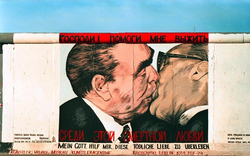
Mein Gott, hilf mir diese tödliche Liebe zu überleben (translated, means Dear God, help me to survive this fatal love)
Original-1990...Redone 2009
Dmitri Vrubel
East Side Gallery

I was in Germany last summer and was able to see the Berlin wall first hand. I really did not know much about it and had no idea what to expect. It was awesome to see that the remains of the wall have been turned into one big art piece all with dedicated to basically an anticommunism theme. I thought that this piece was so striking. I found out that it was inspired by the kiss the two Communist leaders had in 1979 during the celebration of the 30 years of the GDR. They are portrayed as having a homosexual affair by the artist, which would have been unacceptable to communists. In fact, under the reign of Joseph Stalin men who were known to be homosexual could have faced up to 5 years in prison.


Tuesday, February 22, 2011

"Three Musicians" Pablo Picasso

Picasso developed a beautiful abstract scene of three musicians performing a musical piece. The artist uses bright, beautiful colors to express the harmony and the joyful music notes being played. The art work is composed of forms build up together similar to the concept of Cubism and gives the impression of a system of interlocking puzzle pieces. It is also rich in color and texture. The painting reminds of a classic theme taken from the iconography of the commedia dell'arte as mentioned in the book. On the left side, Pierrot plays a woodwind, a harlequin plays the guitar in the center, and a monk sings from a music sheet on his lap.

Lake at Annecy

The name of this painting is "Lake at Annecy" by Cezzane in 1896 using the medium oil on canvas. When I first looked at the painting it took me a second to even comprehend what was in the painting. Everything looks as if it is the same consistency and I couldn't even tell between the mountains and the water. However the more I looked at it the more I liked it. Once I was able to distinguish the different areas in the painting i began to appreciate it. I like how he used very similar colors for all the areas of the paintings but you are still able to see the different structures. I found it very intriguing.

Houses On The Hill


Pablo Picasso’s oil on canvas painting, Houses on the hill was painted in 1909. I find this painting quite different. When I first looked at the painting I didn’t know the name and it just looked like different shapes. But when you look more closely it is really houses going upward. Also I really enjoy the shading done in this painting. Picasso was around during the cubism time and didn’t use many colors when doing paintings like this one.

Fountain


This is an art piece by Marcel Duchamp. It is called Fountain. It is made from readymade porcelain urinal. It is called readymade because it is an already existing object. I find this piece extremely interesting. It is one of the most controversial pieces in Modernistic Art. When people see this, you can definitely tell the discussion of "What is art?" comes up within that conversation. This Fountain and signed "R. Mutt". The art show to which Duchamp submitted the piece stated that all works would be accepted, but Fountain was not actually displayed, and the original has been lost. The work is regarded by some as a major landmark in 20th century art. It is considered part of Dadaism and I think can really make you think about the lengths artists can go to create such famous pieces.

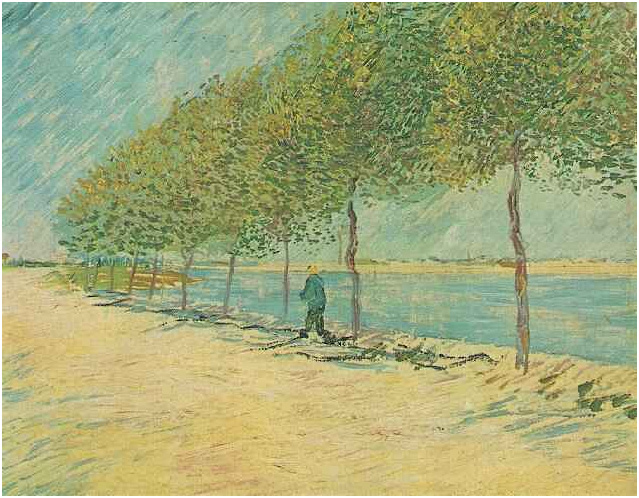
Walk Along the Banks of the Seine Near Asnieres

This painting entitled "Walk Along the Banks of the Seine Near Asnieres was painted by Vincent Van Gogh was painted in June-Juley of 1887. This painting was done on oil on canvas. The painting depicts a man walking along the shore of the Seine River in Paris. I think that this painting is beautiful. I love the contrasting colors of the bright blue sky and the pale sand shore. I also really like Van Gogh's brush strokes and how he was able to create the texture of the trees.

War is No Nice

This painting is at the MOMA and it is done by Martin Kippenberger in 1985. This is a oil and silicone rubber on canvas. The size is 71 x59. I like this painting because of the color of the pink and reds with the green background. I also like how the words war is no nice is through out the painting. The painting has a lot going on but the main focus is the cannon. Some parts of the painting I don't understand what some of the objects that are in the painting that are surrounding the cannon. The War is No Nice is not grammatically correct. I would think it would say War is Not Nice. But there must be a reason the painter put it as War is No Nice. The painting has some feminine colors; if this painting is about the war than I would think that the colors would be darker than pink.

Monday, February 21, 2011

Brothers in Color

Laurie Pace (2009), oil on canvas

Brothers in Color is fascinating in its use of linear colors to create shapes and outlines. The images of the horses alone are very elegant and compelling—creating the illusion of diversity and conformity. Using the multitude of colors, the painting communicates a frantic first glance which transitions into a tranquil herd of horses. I was amazed by how well the images complement each other despite the seemingly random shades. It apparently took 15 layers to complete the painting, which suggests that a great time and thought was done to arrange the subjects. It certainly has a peaceful nature which I find calming and embracing.

Pyramid of Skulls

Pyramid of Skulls is an oil on canvas painting done by Paul Cezanne. He started painting it in 1898 and finished it by 1900. As one of the first impressionist painters, paul cezanne creates space and depth using planes of color. In this painting "pyramid of skulls," the colors are not as bright as his other still lifes of fruits in a basket or on a table. although the colors are not the same as his other still lifes, the simplicity remains. Most of his paintings are simple and bland with very few detail. the reason i chose this painting is because it stands out from cezanne's other works. it is based on a model of skulls placed in a studio.

DREAM AWAY

i like how this picture shows light and dark contrast. it look like it was made out of chalk bit its an oil on canvas painting. i dont know who painted this potrait. she suppose to be sleeping but her neck look broke. but from another angle she look like she laying down (IN A BED OR A COFFIN) because of the flowers.

Francis Bacon


This painting was named Study after Valezquez's Portrait of Pope Innocent X in 1953 by Francis Bacon and was Oil on Canvas. He painted this during the expressionalist period and he often used photographs to paint his portraits. They mostly had to do with post-war and abandonment and as you can see in this portrait the pope looks like he is in an electric chair. The image of him is distorted and he is screaming in it. Edvard Munich painted a portrait of a man screaming and it was very similar to this one. I like this painting for the use of colors and the way he made the pope look distorted.

Saturday, February 19, 2011

pointillism

I like this picture because it looks like an old colored film (like from the film projector). This is a pointillism piece (i dont know who made it) but i like the colors and the scenery. if i'm not mistaken those are penguins next to the boat (i love penguins). my favorite part in this potrait is the splash from the pattle (it looks real).

Friday, February 18, 2011

Garcon a la pipe


This painting of Picasso's was painted in 1905 when Picasso was only 24 years old. This picture was created during Picasso's "Rose Period". The reason that I chose this picture was because I was shocked when I read that this picture was sold for $104 million dollars in 2004 in New York City. I thought that the amount of money that it was sold for was crazy! Don't get me wrong, I think that this painting is very good, but I think that there are other paintings out there that are better. I was also shocked to find out that it was only the #2 most expensive painting ever sold. The most expensive painting ever sold was in 2006 for $135 and is called Portrait of Adele Bloch-Bauer by Gustav Klimt.

Wednesday, February 16, 2011

Jean-Michel Basquiat


"Early moses" 1983. Mixed Media.

Basquiat's works are some of the most interesting pieces of art, in my opinion. Graffiti art usually comes with the stigma of being vandalism, something that people are bothered by. I've been to many places around Europe, and even more locally in Brooklyn where I find that street art is actually beautiful and adds a sense of culture to areas. Sadly he died at a really young age, but he left an awesome legacy.

Pink Moon with Blue Stars


I found this painting to be interesting. It looks like a day and night picture but its mostly night time. There are a whole bunch of objects within the picture so it looks full and junky. I like this painting because of the color and the way its not organize. It definitely look like a nine year old did this but it is still art

Woman With A Parasol

Woman With A Parasol was painted by Henri Matisse in 1905. I really like the style of this painting. I like that Matisse was able to paint a picture by using small rectangular brush strokes, instead of blending the strokes together. This technique creates a beautiful pattern that really makes the picture come to life. I also like the colors that Matisse used in this painting.

Black Orchid

I absoultely love this piece. The fact that she painted the flower black instead of white makes it so much more unique. This painting is by Georgia O'Keefe. It is creative, unique and one of a kind just like her. She is an amazing artist and though some critize her work I think her flowers are wonderful. I hope you do too!

Car-Trailer


I don't know where this is but I thought that it was kind of funny and I like it. I got it off of google from some website called weirdmusic.net, which I think should be called weird artwork. My favorite type of art is form so I thought this was quite interesting.

The Starry Night


Vincent Van Gogh "The Starry Night" I like this picture because of all the dark colors he used and how he used his lines to create the sky at night time.

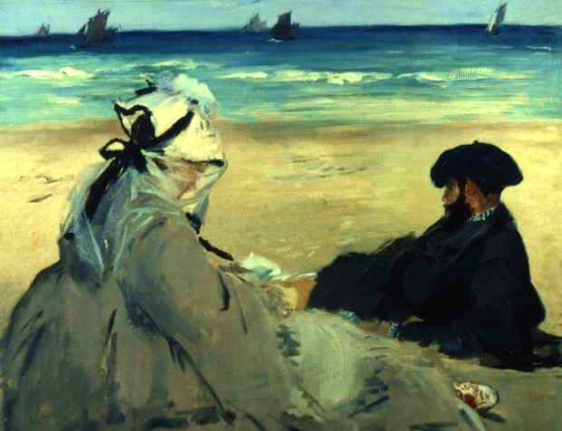
On The Beach

The painting above is "On the Beach" by Edouard Manet (1873). This painting intrigues me because it really captures the haziness you see on a beach. The water from the ocean appears to give everything a blurry appearance and he really captured this. He also did a great job with the coloring of the ocean water, it goes from a light blue to dark blue very smoothly. I also enjoy how the characters in the front look so peaceful. The women appears to be enjoying a book while the man appears deep in thought. In my eyes they both appear content. I feel i can relate to this feeling when I am at the beach.

Diamond Dust Shoes


This is one of my favorite paintings by Andy Warhol. Diamond Dust Shoes was created in 1980. After doing some research, I found that when thinking on selecting shoes as his subject matter for this series, Warhol said, "I'm doing shoes because I'm going back to my roots. In fact, I think maybe I should do nothing but shoes from now on." To create this painting Warhol combined matte black paint with sparkling 'diamond dust' which enhanced the elegance and richness of the painting. This contemporary piece of work attracted me because of its many bright colors and the distinct way that the shoes are placed in the painting.

Head of Ludwig Schames


Ernst Ludwig Kirchner’s piece, Head of Ludwig Schames is dated in 1918 and is a woodcut located in the Museum of Modern Art. I enjoy this piece of art because it is so different. I like that it is so detailed and carved into wood. The man in his woodcut is a friend of his who was an art dealer and featured Kirchner’s work in several solo shows.

Richard Hamilton's Just what is it that makes today's home so different, so appealing? is one of my favorite pieces of pop art. I love how it represents how technology and advertising began to consume peoples lives. When you look at the collage and see the room crammed with icons of the consumer world it almost feels over whelming, like people were in a sense, being suffocated by consumerism and popular entertainment. I also love how Hamilton places the objects to create a successful 3 dimensional scene.

Adolescence


Adolescence is a modern art photograph done by Julia Fullerton-Batten. I really liked this picture because at first I didn't even realize it wasn't a painting. The lighting and coloring of the background seem painted not photographed. The young girl standing in the picture is a giant compared to her surroundings. She seems to be totally unfazed by everything going on around her, her posture doesn't look like she is confused or even concerned by being a giant. I thought the stores were weird choices because at firs it lo ks like this could be part of NYC but then the rest of the picture looks like a simple town with several cars and people. These roads certainly don't look like the city roads and the other side of the street where the girl is doesn't look like there are any buildings.

"Mediterranean Landscape"

Pablo Picasso created this oil on canvas painting in 1952 during his 70 years of artwork production. He is considered the co-founder of cubism and impacted 20th century art greatly. He used his geometric shapes to create a realistic image. If you look closely at this painting you can pick out all of the triangles, circles, squares, etc, but if youre looking at it from a distance you can see the picture as a whole and see that its a landscape. His selection of color also makes part of the painting "pop out" and makes it bright and pleasant to look at. Color selection was just another one of Picasso's talents.

Tuesday, February 15, 2011

"Sorrows of the King"

This painting is by Henri Matisse and it is called Sorrows of the King." I chose this painting because the colors stood out to me. I like how the blues and pinkish purples are bright and that he used many different colors to portray this image. I personally do not like this painting because I dont get it. I don't understand how it can be Sorrows of the King. I don't see a king. It looks like the image in the middle is playing an instrument and the image to the right has some kind of hat on, but still I don't understand that painting therefore I don't like the concept. I guess you can say I am torn about this painting. I like the colors but on the part of the what the painting is or what the images are suppose to be I just don't get it. The image to the left the first one looks like a monkey to me. There is also a lot going on in the painting as well. I don't where to look first and what I am suppose to be concentrated on the most. I don't believe the petals which I am thinking are petals to be all over the place.

Wheatfield with Crows

Vincent Van Gogh (1890), oil on canvas

Wheatfield with Crows is a powerful and intense painting which has been popularly interpreted as Van Gogh's "suicide note" put on canvas. However, contrary to popular myth, this painting is not Van Gogh's final artistic work; but it does convey a memorable signature for his subsequent death. The painting is undoubtedly turbulent, emitting a sense of loneliness in the fields and representing van Gogh’s defeat and isolation in his final years. The symbolic elements are also bold and synergistic—particularly the ominous, dark clouds, the frantic departure of crows, and the multidirectional pathways. I certainly love the mystery behind the image, as well as the tale that follows it.

The Blind Accordion Player (Ben Shahn)


The Blind Accordion Player is a really interesting painting . It shows emotion and a real since of artistic expression. The composition of the painting is well put together. the player's hands in the foreground appear bigger than usual in comparison to the rest of his body. But it seems like the accordion and his hands are closer to our eyes than the rest of his body. The player looks passionate about his notes and the pale colors in the painting give the impression that the player is playing sad notes or just a slow song.

Three Women


"
Three Women," by Fernand Leger is an oil on canvas painting created in 1921, which is 6 feet by 8 feet. It is currently in the Museum of Modern Art in New York. This particular painting shows repetitions of circular and square forms which are themselves repeated on a larger scale in the heads and body-joints. Leger created most of his body paintings by disassembling the body parts and recreating them into different shapes and most of the women he created had long flowing or wavy hair. The faces of his characters have simple features. The three nudes are completely surrounded by objects - objects of comfort and security, objects associated with the consumer and with the artistic aspects of modern everyday life. The reason I chose "Three Women" is because i liked the cubism and shapes that Fernand Leger used. He also painted with very bold colors that pop off the paper. I also was a little confused as to why there were three women and one was flesh color and the other two were white.

Cliff Walk at Pourville


This painting is called "Cliff Walk at Pourville" by Claude Monet. The 26 1/8 x 32 7/16 inch oil on canvas painting was done in 1882 in Pourville, France. "Cliff Walk at Pourville" caught my attention because it brought a sense of calmness over me when I looked at it. The clear blue water along with the clear blue sky makes you imagine you were that person standing on top of the cliff looking at the beautiful ocean. It also makes me think of the summertime at the beach, with the warm sun and cool ocean breeze blowing through the air.

Still Life: Vase with Twelve Sunflowers

This painting, originally called Tournesols, was painted by Vincent Van Gogh in 1888 and is oil on canvas. Vincent painted many versions of this painting during the years he lived with his brother Theo. I think this painting has great use of color. The colors make the flowers look extremely real and life-like. Even the flowers that may have a flaw look well painted and put together.

Soft Self-portrait With Fried Bacon


"Soft Self-portrait With Fried Bacon" was painted in 1941, oil on canvas. Dali was a surrealist Spanish painter whom spent his long  career depicting warped imaginative figures and shapes, typically in vivid colors. He also played with cubism. This particular surreal painting was done during his 8 year long exile to the United States. Dali had fled Spain during the Spanish Civil War and remained in the U.S. until it was safe to return to his home. Dali described this painting as an experiment to paint his outer covering, the mask he wears over his soul. It puts a new perspective on the mask-like quality of his dripping face. I don't have a theory on the bacon, but I like it.

Beach at Heist


Beach at Heist is a painting by Georges Lemmen. It was created in 1891. Georges Lemmen was influenced by Seurat and other neo-impressionists who exhibited their paintings in Brussels. This painting was created using Seurat's idea of pointilism. I really love the look and feel of this painting. The colors are so bright and vivid and reminds me of a summer sunset. The ocean looks nice and calm. To me, the boat on the shore symbolizes the end to a fun summer day at the beach. Also, I like the idea of pointilism because it is incredible to me that paintings such as this one, and ones like Seurat, can be created by using tiny dots for everything.

The Silence That Lives In Houses

The Silence That Lives In Houses was painted by Henri Matisse in 1947. I chose this painting because I like how it tells a story. The outside scene that is visible through the window is bright and lively. Contrastingly, Matisse used dark colors inside the house, possibly to symbolize the silence or secrets that are kept behind closed doors. The two people sitting at the table appear to be reading or studying. They also seem to be bored by their studies. It looks as if they are trapped inside their house while life passes by outside of the window.

Monday, February 14, 2011

Mrs. R


Mrs. R: 1905 by Gertrude Käsebier platinum print
I like this particular work of art because I like the subject and I feel that it shows a beautiful and natural thing. The relationship between mother and child has been depicted in art since ancient times. The light on the mother and baby gives the print an airy feeling and showcases the moment in time.

Wednesday, February 9, 2011

Blue Poles


This painting, Blue Poles, was done by the abstract impressionist painter Jakson Pollock. it was completed in 1952 using enamel and aluminum paint with glass on canvas. I looked at a few of Pollock's other paintings and they all appear to be done in the same paint-splattering manner with different colors. I really liked the way the colors of this painting all came together, however I dont really see how it relates to the title. There is blue in the painting but the most prominant colors to my eye were black, white, yellow, and orange. Not alot of blue and literally no poles. unless the black lines are really supposed to be blue becasue then I can kind of see poles. The estimated price on this painting is $100,000,000-150,000,000. I did like this painting but I think I'll try to recreate it myself before spending that much money.